Last updated on
Use these relaxing colors to paint and decorate your room to create a calming experience at home. Get inspired!
The color of a room has a surprisingly significant effect on our moods. When choosing colors, people often forget to take how they will affect their emotions into account. Instead, they focus on how big or small they will make the space look or fit with other objects in the room.
By carefully choosing the colors of your walls, it will help you achieve the ambiance that you want in your interior design. Of course, the painting process should not be done sloppily. The last thing you want is a blotch of messed-up paint that ruins the relaxation in your room. Instead, contact professional painters for help and ensure the paint colors are applied in a neat, soothing fashion.
Remember that colors are powerful. For instance, if you often find yourself feeling stressed, some of these colors can relax you. Check out these relaxing colors you can use to paint and decorate your home:
Table of Contents
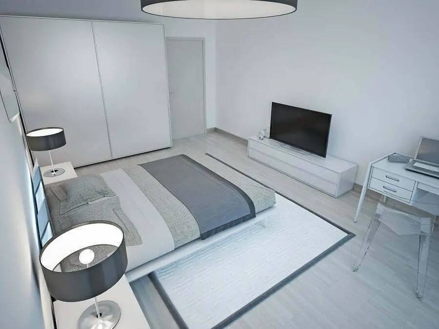
Light Blue
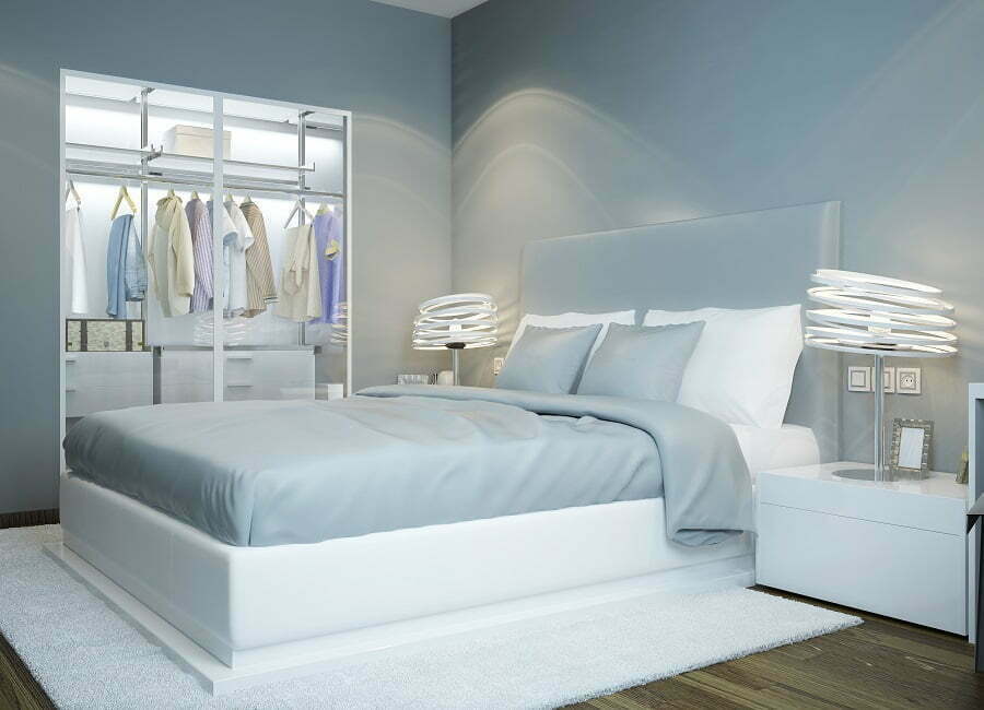
Blue is known as the number one calming color. In fact, it has been found that when we are stressed, we actually seek out the color to calm ourselves. Some studies have even found that it reduces heart rate and can help with blood pressure. Other studies have also found that using blue in a bedroom can help you to sleep.
Lighter colors are generally considered to be more calming than bright colors. As bright colors stimulate the mind, while lighter ones calm it. This makes light blue, especially sky blues, a great option.
Deep Blue
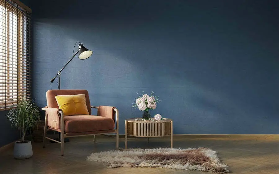
Yes, dark colors aren’t usually seen as being calming. That isn’t always true though. All shades of blue are known to be relaxing and soothing colors. While light blues evoke big open skies, deeper blues tend to evoke wisdom. This will stimulate your mind all the while relaxing it. It may sound impossible, but believe me, it will.
If you are feeling a bit hesitant at the idea of covering all of your walls in such a dark shade, then think of using it on only one or two walls. Using a variety of relaxing colors to decorate your room.
Pink
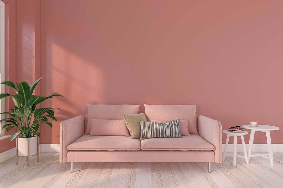
Pink has many bright shades that aren’t calming, but it also has many more subdued shades that are. Coral shades are a good option: they won’t remind you of Pepto-bismal or pink baby’s clothing. Coral also has some cooler undertones, which are known to have a calming effect.
Lavender
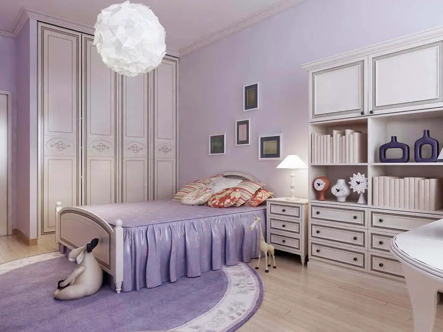
Purple is generally thought of as a stress-reducing color. Lavender is a great shade to go with as it is less intense than darker hues of purple. Purple has also been associated with royalty. This is because, during Medieval times, it was an expensive color to produce and therefore one that only very rich people such as royalty could afford.
What does this mean for us today? It means that purple is a color that feels regal and rich. Making lavender a color that will make you feel like royalty, all the while allowing you to relax. Some other shades of purple that are also relaxing: violet and mauve. The first leans towards blue and the second towards grey, while both will reduce stress.
Light Gray
It is important not to choose a dark shade. Choose one that is light and has pearly undertones. These hues are definitely still gray, but give the impression that a slight white light is shining through them. The color is incredibly clean and gives a feeling of understated class to any room. This will also be incredibly relaxing.
Sage Green
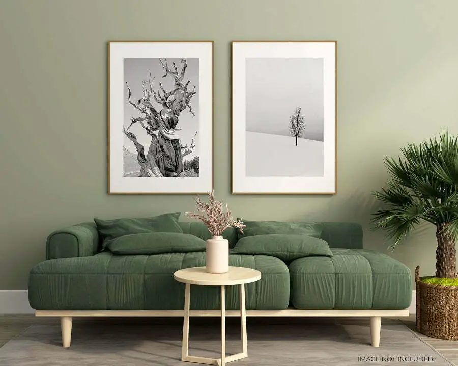
Green is an incredibly relaxing color. It reminds us of places like forests, parks, fields. When in these places, we generally feel relaxed. It is only logical that the paint colors would also make us feel this way.
There are many shades of color to choose from and you pretty much can’t go wrong. If you spent much time in nature, you probably already know that every forest has a slightly different hue, yet they are all calming to be in.
According to Sharper Impression Painters, sage green is a great choice because it is subdued and has some brown undertones. Bright colors tend to stimulate us, while subdued ones will calm the mind. And the brown undertones are reminiscent of the earth, which will have the effect of grounding you.
Cream
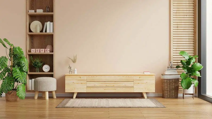
It is important not to choose a straight-up white, as it is actually very hard on the body. Pure white is a bright color hard on the eyes. There have even been studies that have found that it puts us on edge.
However, cream or off-white is softer and does not have this effect. These tones are not bright like plain white. Instead, they have a soft haze to them. This will reflect on your mood as well, making it easier for you to relax and feel at ease. Since they are whites, the color will brighten up your room and work in spaces of any size. So, paint on!
Related Posts
 The Journey of Authentic Buddha Statues from Asia
 What Is the Best Canada Coffee Subscription for Fresh Roasts?
 Commercial Plumbing Contractors: Infrastructure for Business Operations
 Top Corporate Gift Ideas To Impress Employees And Strengthen Workplace Appreciation
 Top Design Mistakes That Make Homes Feel Smaller (and How to Fix Them)