Last updated on
Learn how to create an appealing declutter sale image that catches eyes and drives sales.
Key takeaways:
- Use a neutral or plain background to make your items stand out.
- Consistency in style builds buyer trust and increases value perception.
- High-quality visuals increase buyer engagement and evoke emotions.
- Proper lighting techniques enhance product visibility and appeal.
- Capture small details with macro lenses, focus on one element at a time, and experiment with angles.
Table of Contents
Essential Elements of a Declutter Sale Image

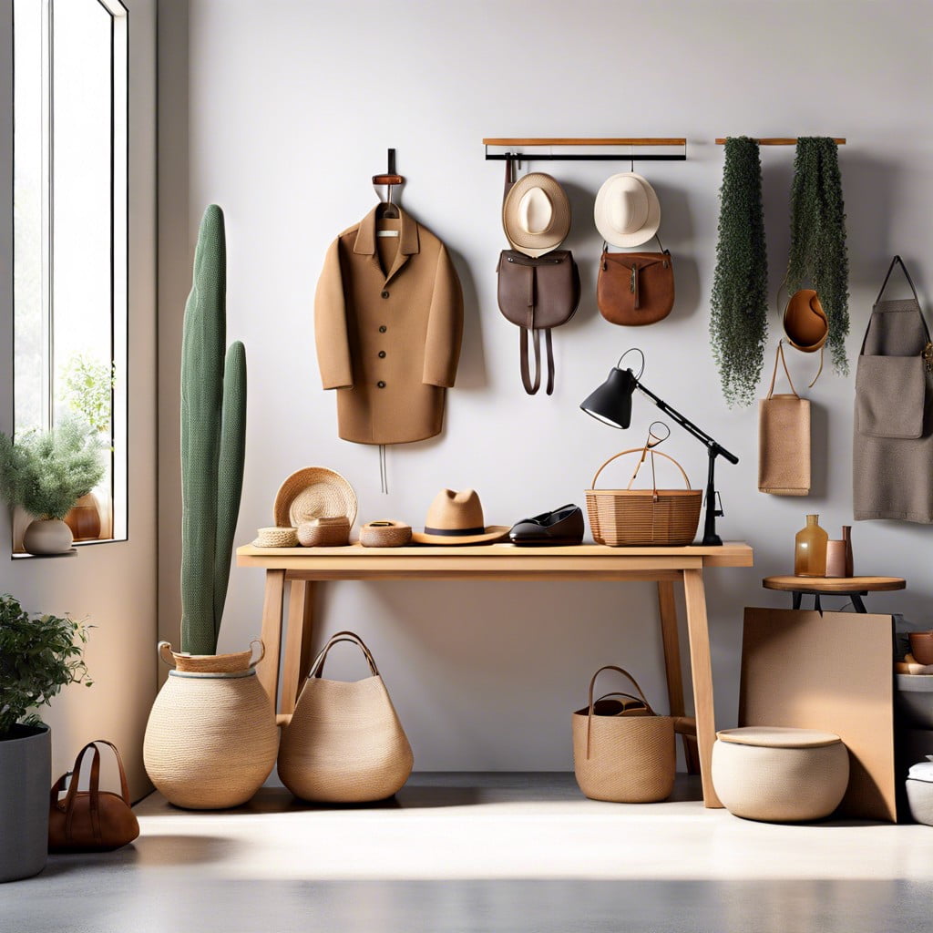
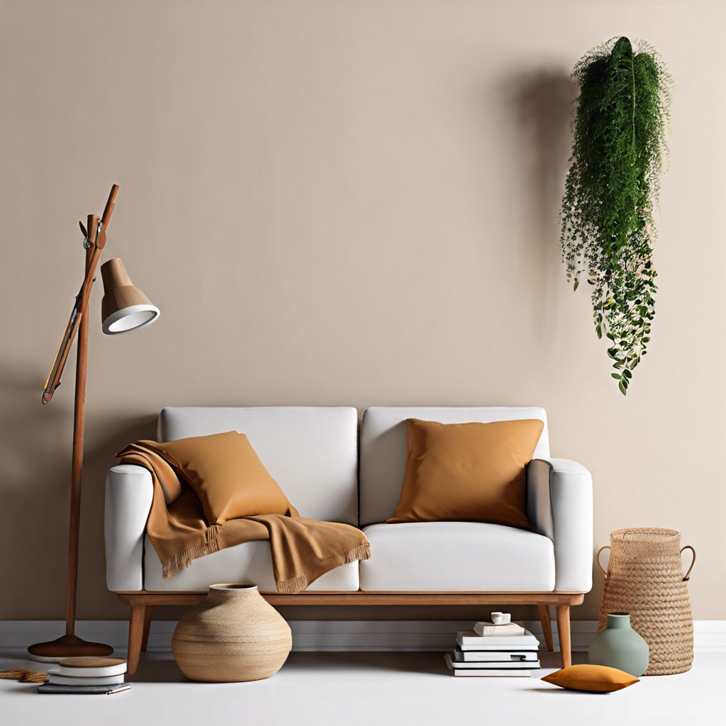
When creating an image for your declutter sale, first consider the background. A neutral or plain background ensures that your items stand out, tempting buyers to envision these treasures in their own spaces. Next, focus on the arrangement. Organize items neatly with enough space between them to highlight individual features without causing visual chaos. This approach not only tidies up the photo but also subtly hints at the organized bliss that potential buyers could achieve. Lastly, consistency is key. Use a uniform style for all your images, such as similar angles and lighting, to give your sale a professional and cohesive look. This consistency helps build buyer trust and can increase the perceived value of your items. Remember, the goal is to make everything look so irresistibly arranged that buyers can’t help but want to take your clutter off your hands!
Impact of High-Quality Visuals On Buyer Interest
Quality visuals are not just eye candy; they wield the power to boost buyer engagement dramatically. High-resolution images reveal the texture and condition of items, building trust and reducing buyer hesitation. Bright and clear photos tend to hold a viewer’s attention longer, increasing the likelihood of a sale. Moreover, aesthetically pleasing compositions can make your sale items look more appealing and valuable, setting a positive tone for potential buyers. A visually attractive set-up can also evoke emotions, making the shopping experience enjoyable and memorable, which is critical in turning viewers into buyers.
Lighting Techniques to Enhance Product Visibility
Shine a spotlight, literally! Proper lighting can dramatically increase the appeal of items in your declutter sale photos. Start with natural light whenever possible, placing products near large windows to absorb soft, diffused daylight. This reduction in shadows and highlights will give potential buyers a clearer view of what’s on offer.
For darker days or indoor shots, swing into action with artificial lights. A simple ring light or even strategically placed lamps can eliminate unwanted shadows. Adjust the angle to highlight the textures and colors of your items, making them pop.
Remember, the goal is to mimic daylight to keep your images looking fresh and true to color. Direction matters — by positioning your light source slightly above and in front of your items, you can avoid casting odd shadows and ensure the details shine through.
With these lighting hacks, you’ll cast your products in the best possible light, quite literally, making them irresistible to shoppers!
Tips for Capturing Small Details in Declutter Photos
When photographing items for your declutter sale, the devil is truly in the details. Close-up shots not only attract buyers but also give them confidence in the quality of your items. To ensure every tiny detail is showcased:
Use a macro lens or the macro setting on your camera. This approach allows you to capture intricate textures and features up close, making the image more appealing and informative.
Focus on one element at a time. Position your product so that specific details, like craftsmanship or unique designs, are the central focus of the shot.
Consider natural light or a softbox to eliminate shadows and highlight the fine details. Direct sunlight can create harsh shadows and obscure meaningful nuances, while soft, diffused light reveals depth and texture.
Keep your backgrounds simple. A neutral or solid-colored background ensures that nothing distracts from the details of the item. Sometimes less really is more, and a minimalist approach can amplify the impact of small features.
Experiment with angles. Sometimes a unique angle can bring out details that a straightforward shot might miss. Shift around your product and experiment with different perspectives to find the most visually engaging setup.
With these tips, your declutter sale photos will not only look professional but will also be compelling enough to draw potential buyers into the details that make your items unique.
Legal Considerations: Using Royalty-Free Images
Before splashing your declutter sale across social media or flyers, ensure your images are legally safe to use. Opt for royalty-free images to avoid treading on a photographer’s toes—literally and legally.
Royalty-free doesn’t mean free; it means you pay once to use the image multiple times without paying per use or distribution. Always check the license details. Some images require you to give credit to the creator—even in your garage sale poster!
Platforms like Unsplash or Pixabay offer a plethora of images that scream “Take me home!” without the added legal drama. Just make sure to use the search filters for commercial use to keep your venture hassle-free.
Remember, even the perfect snapshot could end up costing a fortune in legal fees if it’s not royalty-free. So, keep it clean and legal, and your sale will be nothing but smooth selling!


